Ever squinted at a bright screen in the middle of the night? Or struggled to read dark text on a sunny day? That’s why the digital world is embracing both dark and light modes! This exciting design trend isn’t just about looking modern – it’s changing how we experience websites and apps by putting comfort and choice in your hands. At Melbourne Web Studio, we’re always looking for ways to make websites better for people who use them. Let’s explore how these different color schemes can help your business.
What Are Dark Mode and Light Mode?
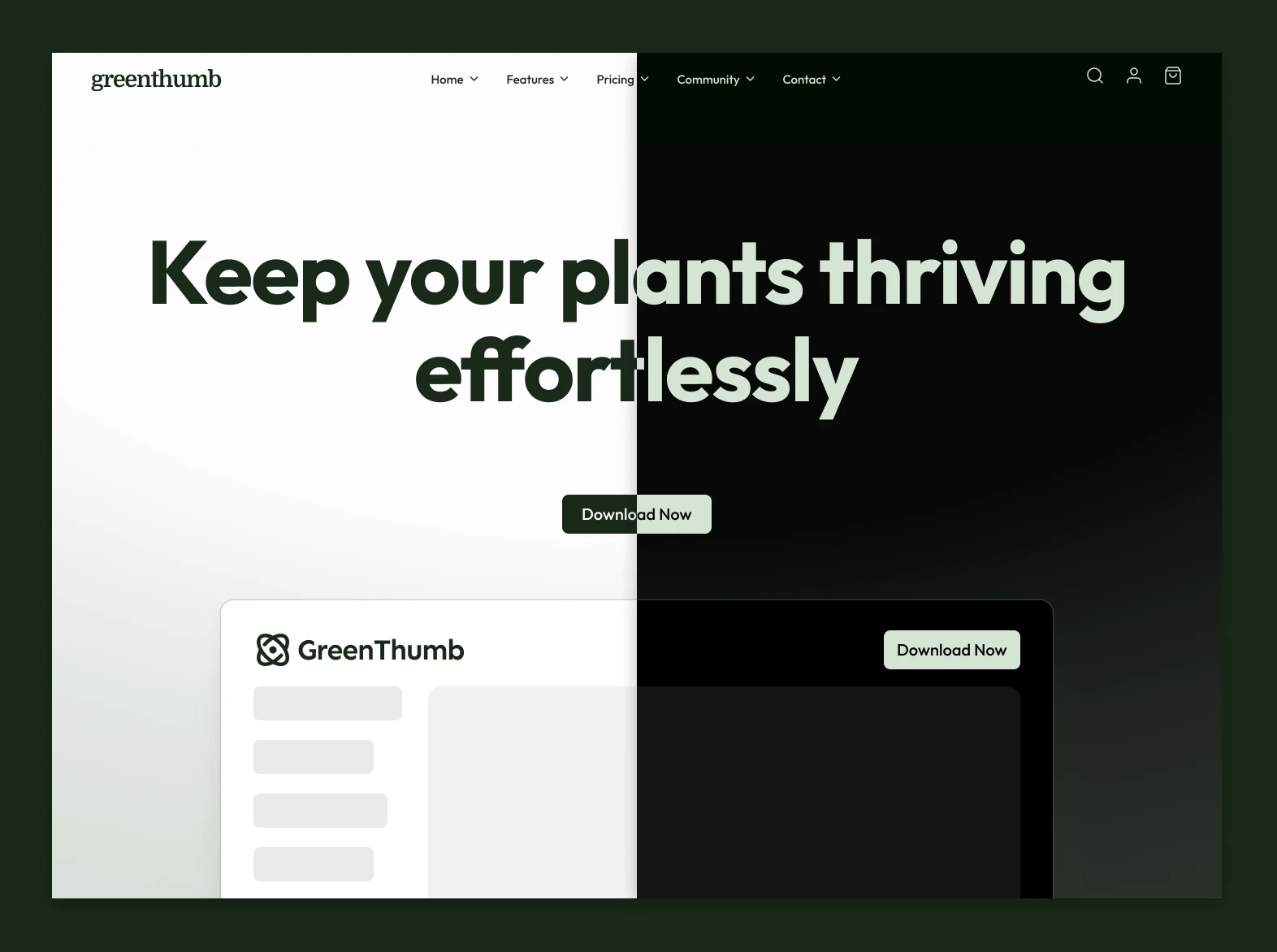
Light Mode is what most of us are used to – bright backgrounds with dark text. It’s like reading a book or a newspaper.
Dark Mode flips this around, using dark backgrounds with light text. It’s like writing with chalk on a blackboard.
These different ways of showing content aren’t just about looks. They help people use your website or app in various situations. More than 65% of people prefer to have the choice between light and dark modes, and 82% of people will use dark Mode at least sometimes when it’s available.
Why Your Customers Will Love Having Options
Less Eye Strain
Have you ever looked at a bright phone screen in a dark room? Ouch! Dark Mode can reduce eye strain by up to 65%, especially at night or in dim lighting. This makes your website more comfortable to use, so people stay longer.
Better Battery Life
Dark Mode can save between 30-60% of battery life on phones and tablets with OLED screens. Your customers will appreciate being able to browse your site longer without draining their batteries!
Personal Preference and Accessibility
Some people find dark backgrounds easier to read, while others prefer light backgrounds. By offering both, you’re making your website more accessible to everyone. This is particularly important for:
- People with vision sensitivity
- Users with certain types of color blindness
- Anyone who wants to read content for a long time
Modern Look and Feel
A website offering light and dark modes feels up-to-date and thoughtfully designed. This creates a positive impression of your brand as modern and customer-focused.
How Light and Dark Modes Boost Business Performance
Websites with dark mode options see users spend about 14.5% more time on their pages. Apps with dark Mode show 18% better retention rates after a month. That means more people stick around and keep coming back!
E-commerce sites report a 7% increase in nighttime purchases when dark Mode is available. Content websites see people reading 15% longer when they can switch to their preferred Mode.
By giving customers control over how they view your content, you’re showing that you care about their experience. This builds trust and loyalty.
Best Practices for Adding Light and Dark Mode to Your Website
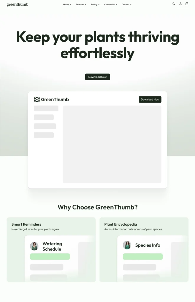
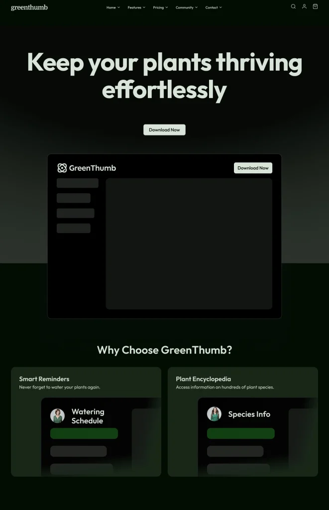
Showcase Project: Arctic Funding
Here’s a great example of our work at Melbourne Web Studio demonstrating effective implementation of dark and light Mode. Arctic Funding, a fintech platform for stock trading, perfectly showcases the best practices for implementing colour schemes:
Rather than simply inverting colours, we carefully designed light and dark versions with user needs in mind. Their website needed to serve users checking investment opportunities at all hours of the day, so both colour schemes were required to be equally effective.
How we applied best practices:
- We maintained the bright blue accent colour across both versions to preserve brand identity
- We chose a softer navy for dark Mode rather than pure black to reduce visual strain
- All text maintains optimal contrast ratios in both modes for perfect readability
- We implemented both automatic detection of system preferences and a manual toggle switch
The light Mode uses a cool blue background that feels fresh and professional during daytime use. At the same time, the dark Mode reduces eye strain for night-time traders with its deep navy backdrop.


Artic Funding Website Project – Light and Dark Mode
Design Considerations
Don’t just flip colours when creating light and dark versions of your website! Here’s what to consider:
- Don’t use pure black backgrounds in dark Mode – slightly softer dark colours (like very dark grey) reduce visual “vibration” and are easier on the eyes.
- Ensure the text is always easy to read with good contrast in both modes.
- Design elements might need completely different colours, not just inverted versions.
- Images and logos need different versions for each Mode.
Technical Implementation
The good news is that modern web technology makes it easier than ever to implement colour schemes. Here are the main approaches:
- Automatic detection: Your website can automatically match the user’s device settings using something called “prefers-color-scheme” in CSS
- Manual toggle: Add a simple switch that lets visitors choose their preferred Mode
- Best approach: Do both! Default to the user’s system preference but still give them a button to switch if they want
Colour Selection Tips
- Define alternate colours for each shade in your palette.
- Use CSS variables to make implementation easier.
- Test both modes thoroughly – colours can look very different on various devices.
Artic Funding Website Project – Colour Scheme Switching
The Future of Color Schemes in Web Design
The way we think about colour schemes is still evolving! Here are some exciting trends to watch:
Smart, Adaptive Interfaces
Soon, websites might automatically adjust their appearance based on the following:
- Time of day
- Ambient light detected by device sensors
- User behaviour patterns
More Personalization
Beyond just light and dark, future websites might offer:
- Multiple colour themes to choose from
- Customizable contrast levels
- Font size adjustments that work perfectly with each colour scheme
Standard Practice
Dark Mode is quickly becoming expected, not just a nice bonus. About 76% of major websites now offer some form of dark Mode, and design professionals increasingly see it as a standard feature rather than an optional extra.
Making the Right Choice for Your Website
While adding both light and dark modes is beneficial, it does require careful planning. Here’s what to consider:
- Evaluate your audience: Do they use your site at night? On mobile devices? For extended reading sessions?
- Plan the design carefully: Don’t rush into adding dark Mode without a thoughtful colour selection
- Test thoroughly: Make sure everything looks good and functions properly in both modes
- Get feedback: Ask real users what they think of your implementation
Ready to Enhance Your Customer Experience?
At Melbourne Web Studio, we specialize in creating websites that adapt to your customers’ needs and preferences. Light and dark mode options are one way we help you provide an outstanding user experience that keeps people coming back.
We can help you implement these features in a way that strengthens your brand and makes your website more accessible and enjoyable for everyone.